The Map and a New Style
Come next demo day, there will be two major differences: the map and a brand new visual style.
The Map

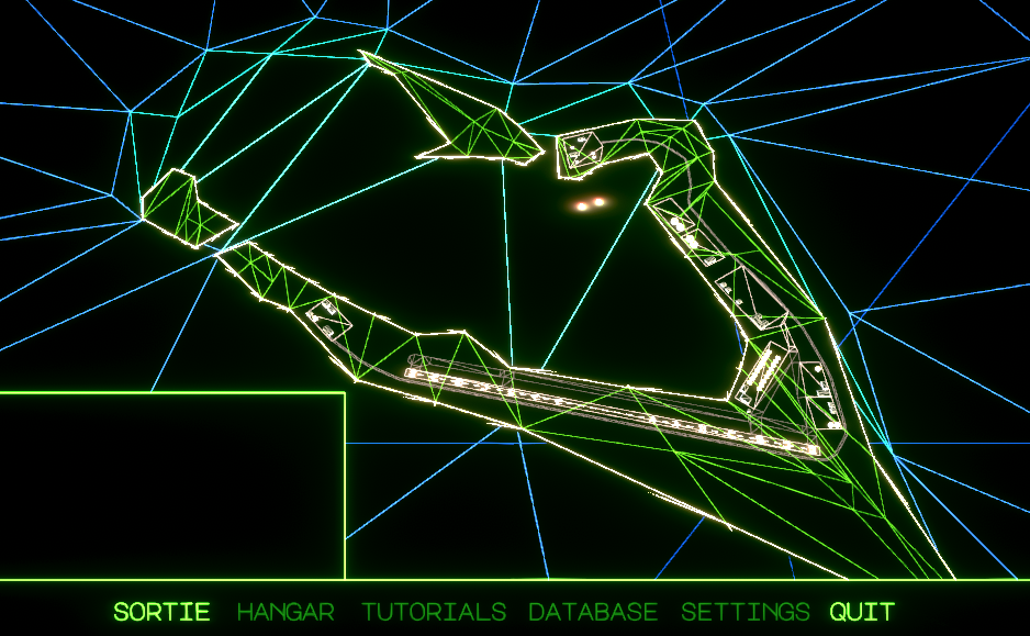
The map screen is going to be the main point of interaction to the game when you're not flying. From here you'll be able to scroll around the map to get an idea of where things are and plan your next sortie. For the next demo, the map won't do much, but its integration into the game loop is extremely important going forwards.
The New Look

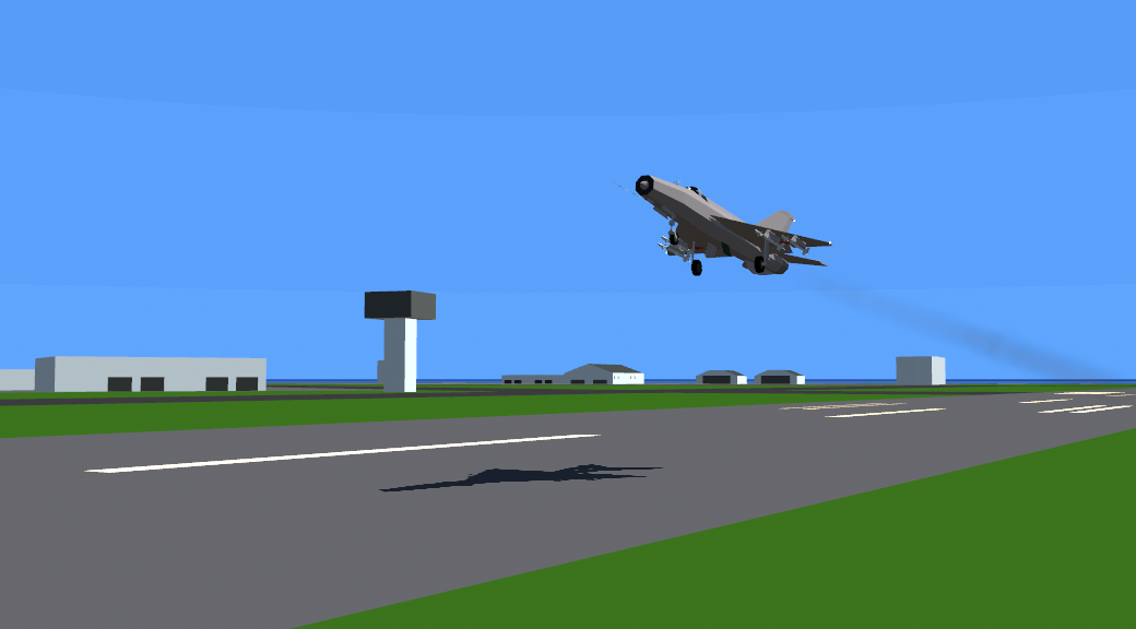
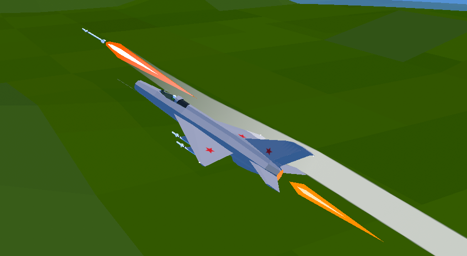
The visual style of the first demo was largely a holdover from the prototype, and my working with whatever assets I could get my hands on. There wasn't a deliberate look to it at all. After a lot of thought, research, and hands on experimentation I've finally decided on a style that is reminiscent of early to mid 90s flight sims. It hits a sweet spot for me of visually striking, performance, and most importantly the ability for me to create content in this style.

I realize this is a dramatic shift, but I'm very pleased with how this is turning out. I've really grown to appreciate the simplicity, expressiveness, and clarity of this look and I hope you will too. I'm looking forward sharing this on the next demo day, with everybody.
Get Tiny Combat Legacy
Tiny Combat Legacy
Sim-lite flying with customizable loadouts
More posts
- Tiny Combat Arena is now in Early Access!Feb 24, 2022
- Tiny Combat Arena is now on Steam and published by MicroProse!Jun 22, 2021
- Big changes are coming!May 13, 2020
- 0.4.0: Map Visual Overhaul and GroupsJan 06, 2020
- 0.3.0: Dogfighting Foundations UpdateNov 05, 2019
- New Build! The Real Work Begins Here.Sep 07, 2019
Leave a comment
Log in with itch.io to leave a comment.